Melissa,
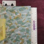
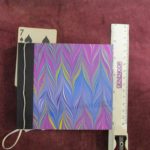
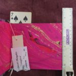
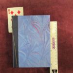
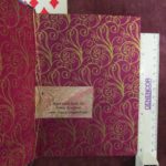
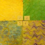
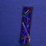
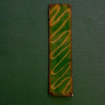
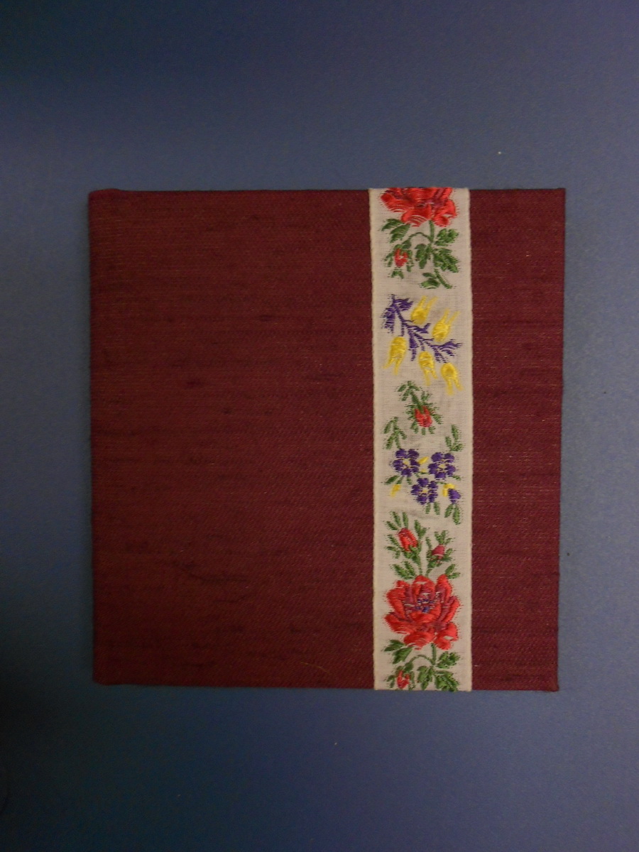
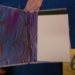
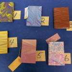
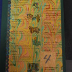
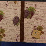
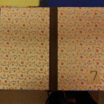
These are the books I have at this moment. They are all at the local Art Center Gallery, but I can pick them up at any time, assuming they haven’t been sold.
-
- Leather spine
-
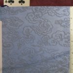
- Figured Lokta paper
-
- Florentine paper
-
- Figured Lokta paper
-
- Figured Lokta paper
-
- Florentine paper
-
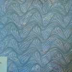
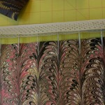
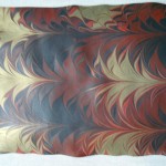
- Sumanigashi marbling
-
- Chiyogami endpapers
-
- Indian marbling
-
- Leather spine
-
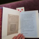
- Text of Hamlet (not blank)
The first seven are blank books ranging from $30 to $45, the last is Hamlet that I reformatted and printed. I was tired of making blank books! It has a leather spine, was sewn over cords and has my handsewn endbands. It is $75.
****************************************************************************************************************88
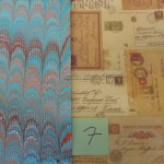
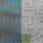
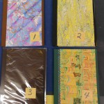
Tova,
Here are the papers I have on hand that might suit your needs. Please let me know if you would like any of those or want me to make a special order for you.
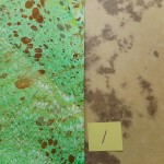
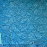
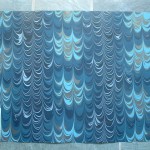
I also have a number of “seconds”, papers with flaws, in the same color range. I’ve taken photos of four, but I have more if you are interested. These papers are not perfect and have small flaws. The close-ups show the flaws. Depending on the size and shape of the endpapers, they can be cut around the flaws. I frequently use them that way. I sell seconds at a discount.

Let me know what you think.
&&&&&&&&&&&&&&&&&&&&&&&&&&&&&&&&&&&&&&&&&&&&&&&&&&&&&
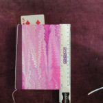
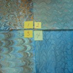
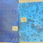
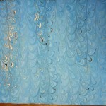
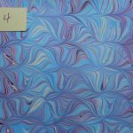
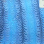
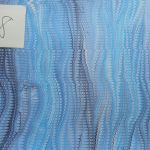
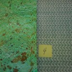
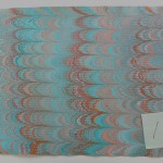
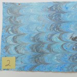
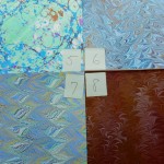
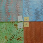
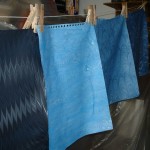
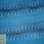
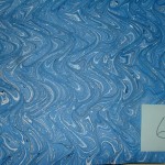
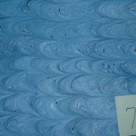
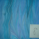
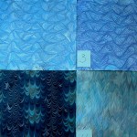
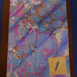
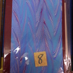
Susan,
Here are the blue papers, cerulean blue plus black and white. Be sure to click on photos to enlarge.
Let me know if there are any you want and I’ll bundle them for you.
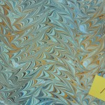
-
- Good piece. Slight wobble on edge $8
-
- Good piece. Slight edge $8
-
- Small bubble & line $7
-
- Hesitation lines $7
-
- Two bubbles $6
-
- White contamination $5
%%%%%%%%%%%%%%%%%%%%%%%%%%%%%%%%%%%%%%%%%%%%%%%%%%%%%%%%%%%
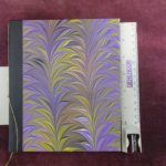
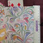
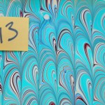
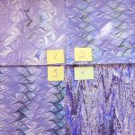
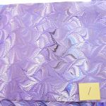
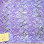
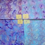
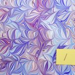
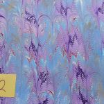
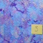
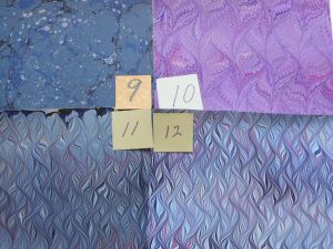
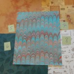
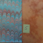
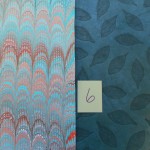
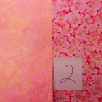
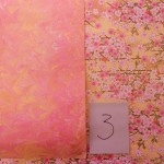
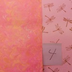
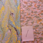
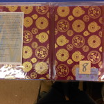
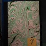
Papers for Jacqueline:
Again, the photos are lighter and less intense than the actual papers. The groups of four are closer in color than the single shots. I’m really pleased with the papers, but disappointed with the photos. I can try again or run them through Photoshop to get more accurate colors if you can’t decide. Please choose one for the endpapers of the book and two alternates in case I need them for the box or pamphlet. Thanks.
-
- Selecting the perfect sheet
-
- #1
-
- #2
-
- #3
-
- #4
-
- Selecting the perfect sheet
-
- #5
-
- #7
-
- #8
-
- Selecting the perfect sheet
-
- #9
-
- #10
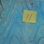
-
- #11
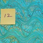
-
- #12
^^^^^^^^^^^^^^^^^^^^^^^^^^^^^^^^^^^^^^^^^^^^^^^^^^^^^^^^^^^^^^^^^^^^^^^^^^^^^^^
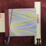
All of the papers photographed a bit lighter than they are. Must be all the snow!
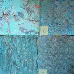
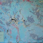
I didn’t have as many papers with blues & purples as I’d thought. The first group has some purples with the blues, but one of the purples has a pinky cast that I’m not sure about. (Click to enlarge.)
Second group: No purples here, but you can get an idea of patterns and “feel”. Just imagine them with more black and deep purple. Ignore the flaws, these papers are “seconds”, yours won’t be.
Last: Here are some more patterns and colors. Unfortunately, these are small sheets of paper, but I think they are closer to the colors you want.
Let me know which patterns and colors you like. I’ll be doing a marbling session in the next few weeks and I can work with your colors in some of the patterns you like.
&&&&&&&&&&&&&&&&&&&&&&&&&&&&&&&&&&&&&&&&&&&&&&&&&&&&&&&&&&&&&&&&&&&&&&&&&&&&&&&&
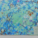
Ruth’s papers
Inside papers: Click to enlarge. Second try.
******************************************************************************************
Let me know what you think. I have a few more if you need more choices, but these were the best color matches.
***************************
The colors on all of these papers are actually darker than shown. The colors are more accurate on the group pix. I can redo the photos for any you like to be closer to the real thing. I must have used the wrong camera setting. #8 is on quite heavy paper and I’m not sure how well it will bend. If you choose it, I’ll do a trial piece first to make sure it won’t crack.
Let me know what you think.
##############################################################
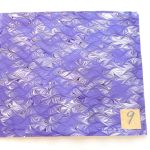
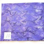
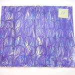
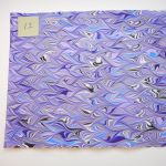
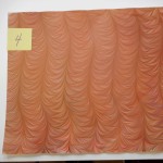
Mark’s papers
Colors are not exact as I haven’t corrected them. They are pretty close.
***********************************************************************
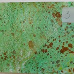
Papers for Andrea
These are all papers I haven’t yet listed on Etsy. Click to enlarge. They haven’t been color-corrected yet. I can take close-ups or correct any that you like. Let me know what you think.
******************************************************************
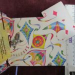
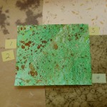
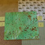
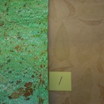
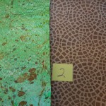
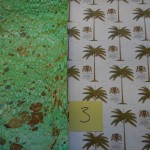
Special order for Natalie
Some choices for endpapers. You can’t really see the covers and the endpapers at the same time, but they need to be coordinated to make the book feel right.
-
- Relationship of covers & endpapers
-
- Choice 1 for Italian paper
-
- Choice 2 for Italian paper
-
- Choice 3 for Italian paper
-
- Choice 4 for Italian paper
-
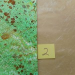
- Choice 1 for my paper
-
- Choice 2 for my paper. Paper is green, not brown!
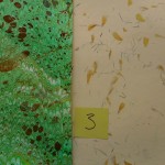
-
- Choice 3 for my paper
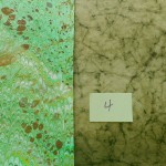
-
- Choice 4 for my paper
-
- Choice 5 for my paper
Let me know what you think.
Nancy
*********************************************
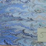
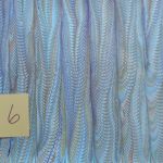
Special Order for Leslie
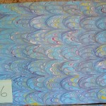
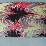
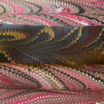
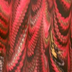
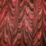
Here are close-ups of the first marbling session:
-
- The streak is a shadow, not on the paper
-
- Smaller arches
-
- Different pattern
-
- Blob in upper left
-
- Hesitation lines on left edge
Be sure to click on the photos to enlarge. I’ll add the second session close-ups as soon as they are dry.
There are some flaws in #7 and #8, but I think you can work around them if you like the patterns. They will be discounted, of course. I can send better pictures of any you need. My camera was giving me fits today, so they are not the best! Some days are like that.
***********************************************************************
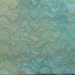
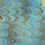
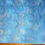
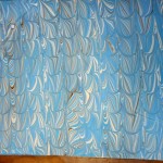
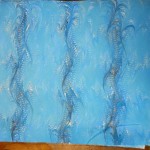
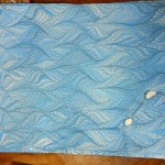
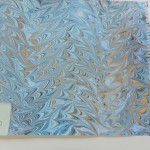
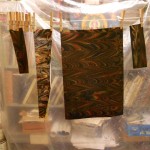
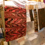
Special order for Honor.
I’ve started a marbling session and am playing with your blues. The photos do Not show the colors very well. My good camera has wimped out and this one has problems. Most papers are a bit darker than shown. I tried a bunch of different patterns. Let me know your thoughts on colors and patterns. I can adjust the colors in the photos to match the real thing better if there is a pattern you like.
-
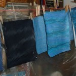
- Drying line
-
- Drying line
-
- Drying line
-
- Drying line
-
- Dark blue paper
-
- Black paper
-
- Navy paper
-
- White paper
-
- White paper
-
- White paper
-
- White paper
Be sure to click on photos to enlarge.
*******************************************
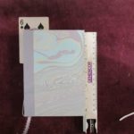
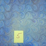
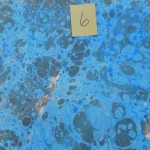
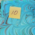
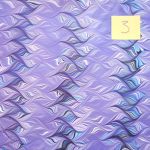
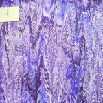
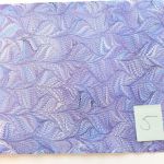
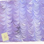
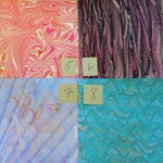
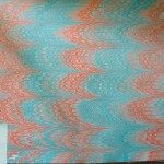
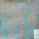
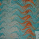
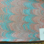
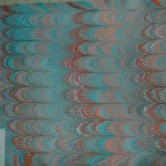
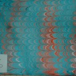
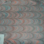
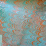
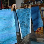
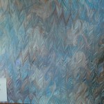
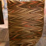
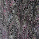
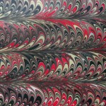
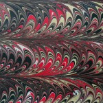
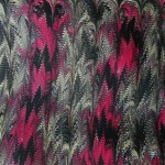
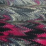
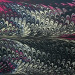
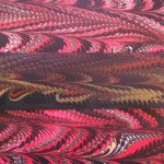
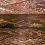
Paper choices: These are the papers I have on hand that might suit. The colors shown are not exact, unfortunately. I’ve made notes on each. As you can see there is almost no true navy. It’s a very difficult color to obtain in marbling unless I use dark paper.
Be sure to click on the photos to enlarge and see comments.
Let me know what you think. If there are any that interest you, I can try to play with the colors so they are truer to the original.
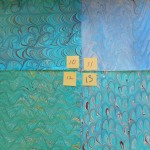
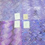
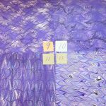
-
- Papers #1 to #4
-
- Papers #5 to #8
-
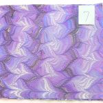
- Number 1 This one has the truest blue with fine lines of white & black
-
- Number 2 Marbled on black paper. Aqua and metallic gold
-

- Number 3 Not good photo colors. There is strong contrast in the piece and the dark is deep purple.
-
- Number 4 This has two layers of marbling one on top of the other.
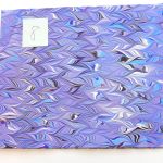
-
- Number 5 More teal than blue, but interesting.
-
- Number 6 Lots of color interest, but again more on the aqua side.
-
- Number 7 Black and white accents with a touch of gold.
-
- Number 8 Similar pattern to 3, but lighter and more green tones
Nancy
^^^^^^^^^^^^^^^^^^^^^^^^^^^^^^^^^^^^^^^^^^^^^^^^^^^^^^^^^^^^^^^^^^^^^^^^^^^^^
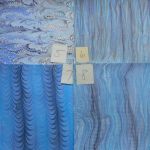
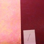
Paper for Diane.
Overview of the paper drying.
Close ups of paper. Click to view information. Please ignore any technical problems with these papers. This is just to show colors. In all of them the gold looks like yellow or white. It really doesn’t show well on white paper. (see Shimmer & Shine) You may have to scroll down to see my comments under the photos. Please leave any comments you have on individual papers. It makes it easier to know which one you mean!
-
- Alizarin Crimson with #0 comb and #4 rake
-
- Alizarin Crimson with #0 comb and #4 rake
-
- Both Cadmium Red and Red Oxide used.
-
- Both Cadmium Red and Red Oxide used.
-
- Cadmium Red, #0 comb, #4 rake
-
- Cadmium Red, #0 comb, #4 rake
-
- Cadmium Red, #0 comb, #4 rake
-
- Napthol Red Steel comb and #4 rake
-
- Napthol Red Steel comb and #4 rake
-
- Red Oxide. Steel comb and #4 rake
-
- Red Oxide. Steel comb and #4 rake
-
- Red Oxide. Steel comb and #4 rake
-
- Showing the lines made by the rake.
-
- Steel comb and #4 Rake
-
- #0 comb and #4 rake
Combs and rakes are sized by the distance between the teeth. The comb makes the “loops” and the rake makes the cross-wise divisions. They can be any combination of small and large. Let me know your preference.
-
- Colors on black card stock
-
- Same colors on white.
-
- Comparison of white and black backgrounds
A quick look at how the colors look on black paper and the same pattern on white paper. When I do the close-ups of the afternoon work, you’ll see this effect more clearly.
The afternoon went better than the morning. I’ll get those photos up as soon as I can, but I have commitments most of the day on Wednesday so I’m not sure when you’ll get to see them.
SECOND BATCH
-
- Cadmium Red steel comb #3rake
-
- Cadmium Red steel comb #3rake
-
- Red Oxide steel comb #6 rake
-
- Red Oxide steel comb #6 rake
-
- Red Oxide on black paper
-
- Red Oxide on black paper
-
- Difference between black and white papers
-
- Difference between white & black papers
-
- Comparison of white and black backgrounds
Huge difference in gold on black paper.
Nancy
*****************************************************************************
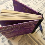
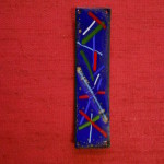
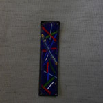
Sam & Morgan’s books 7/27/13
Here are some choices for the color of the cover of your books. Let me know which ones you like best. Morgan – sorry the greens didn’t photograph very well. They really are nice colors! I can try to send you a sample, it you’d like. Be sure to click on the thumbnails as the colors are better in the larger photos.
-
- Sam red
-
- Sam blue-grey
-
- Sam blue
-
- Morgan – drk green
This is what the cover of your book will look like with the ribbon replaced by your piece.
This is what your book will look like.
I wish I had thought of having you both help me with these earlier. You could have made a bunch of them in no time!
Cheers!
********************************************************************************
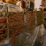
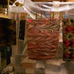
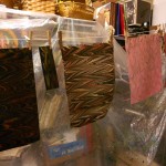
Memo Pad holders
Portfolios with writing pads
Portfolios for loose paper or presentation
^^^^^^^^^^^^^^^^^^^^^^^^^^^^^^^^^^^^^^^^^^^^^^^^^^^^^^^^^^^^^^^^^
Decisions to be made! The cover paper for a book can be cut from anywhere on a sheet of paper. With most designs, it doesn’t matter where, but with large designs it can make a huge difference. Below are examples of three books I am making, each of which presents different challenges.
The first is David’s book. The cover is going to come from a large poster. This is the whole poster.

I have made a template the approximate size of the book’s cover and chosen several possibilities for the front cover. The back cover will largely depend on what is left after the front is cut. Click on each photo to see the complete selection.


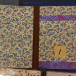
After the cover is chosen, a decision has to be made about the endpapers. Although the cover and the endpapers aren’t seen at the same time, I like the two to be compatible and carry a theme. Here is an example on another book.

Cover

Endpapers
Here are some possible endpapers for David’s book shown next to the cover paper.


Both have a Medieval feel, but contrasting colorways. I prefer #1 since it echoes the cover more faithfully.
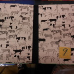
Another problem with cover placement can occur when the size of the book doesn’t match well with the print for the cover. Here is Joseph’s book’s cover paper.

This paper has eight different large images repeated twice. Because of spacing, the images on the edges produce awkward covers, but using the inside images wastes a lot of paper. Here are some examples of possible covers. Click on images to see the full cover template.


I think my favorite is the second #3 (yes, it was supposed to be #4) because it is nicely balanced and doesn’t have too many distracting bits on the edges. Any of the center motifs could be nicely aligned. This paper would be better on a slightly smaller book, but it will be fine on this size if carefully cut.
Here are the choices for Joseph’s endpapers.


This paper could have almost anything for the endpapers, but I think I prefer #3 for the richness of color and depth it gives. Number 1 is not as shiny as it photographs, but may be a bit bland for the cover.
The last book has an easy allover pattern for the cover that could be cut anywhere.

The maps are small enough that no matter where I cut, they will all be visible. Yeah!
Endpapers for this one were a bit harder. Robert’s endpapers:


Not sure which of these I prefer. The ships in #2 go well with the maps and #3  are nicely traditional for endpapers.
So there you have it. Three books, three papers and many choices!
Chanced upon your website. Enjoyed your comments and range of paper arts!
Thanks for finding me. I’m glad you enjoyed the site. It really needs a major overhaul and updating.
Nancy